SAI Website Redesign
A clearer, more scalable information architecture for a growing institutional website.

197 → 25
Published pages, after the content audit
1 level
Max depth below the main menu
3 breakpoints
Designed together, not adapted
Context
A website caught between two systems.
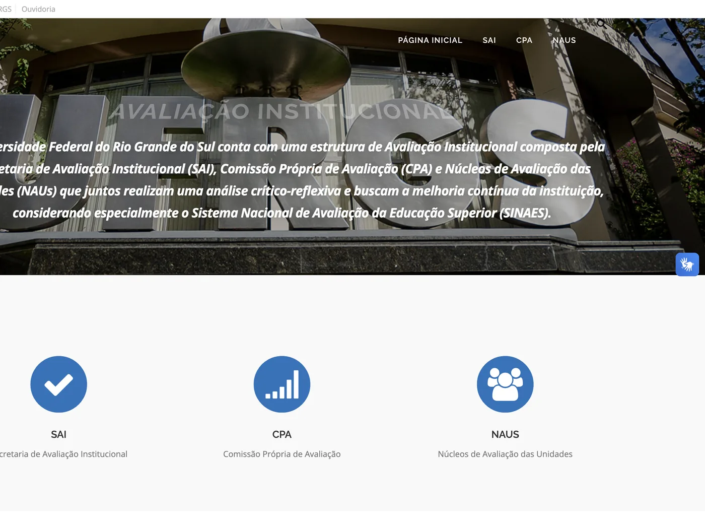
A partial redesign had left sections following different visual patterns and content structures. As information kept growing, the site became harder to navigate, maintain and expand.
As the only designer, I led the UX/UI redesign and the content reorganisation, keeping the site aligned with UFRGS's visual identity.
How might we simplify a growing website without limiting how much information it can hold?
Structure
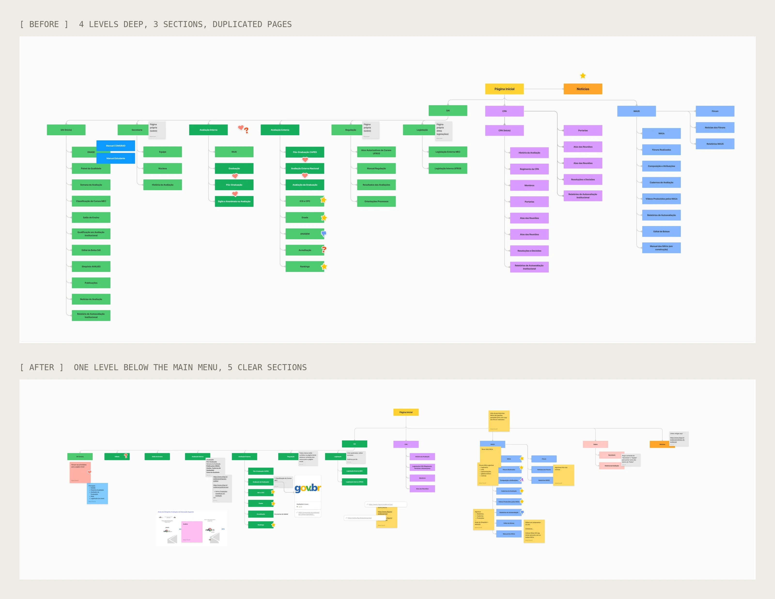
Shallow by design.
I rebuilt the navigation around clear categories, never more than one level below the main menu, with level indicators so people always know where they are.
The structure also gives new content an obvious place to go, so the site stays organised as it grows.
Navigation
Less digging, more finding.
Key information now sits one or two clicks from the main menu, instead of buried in nested pages.
Before

After
Components
Built for content that keeps growing.
Two dropdown variations let dense pages reveal information step by step, cutting page length, especially on mobile.
I documented and demonstrated the pattern in WordPress, so administrators can add pages without a designer.
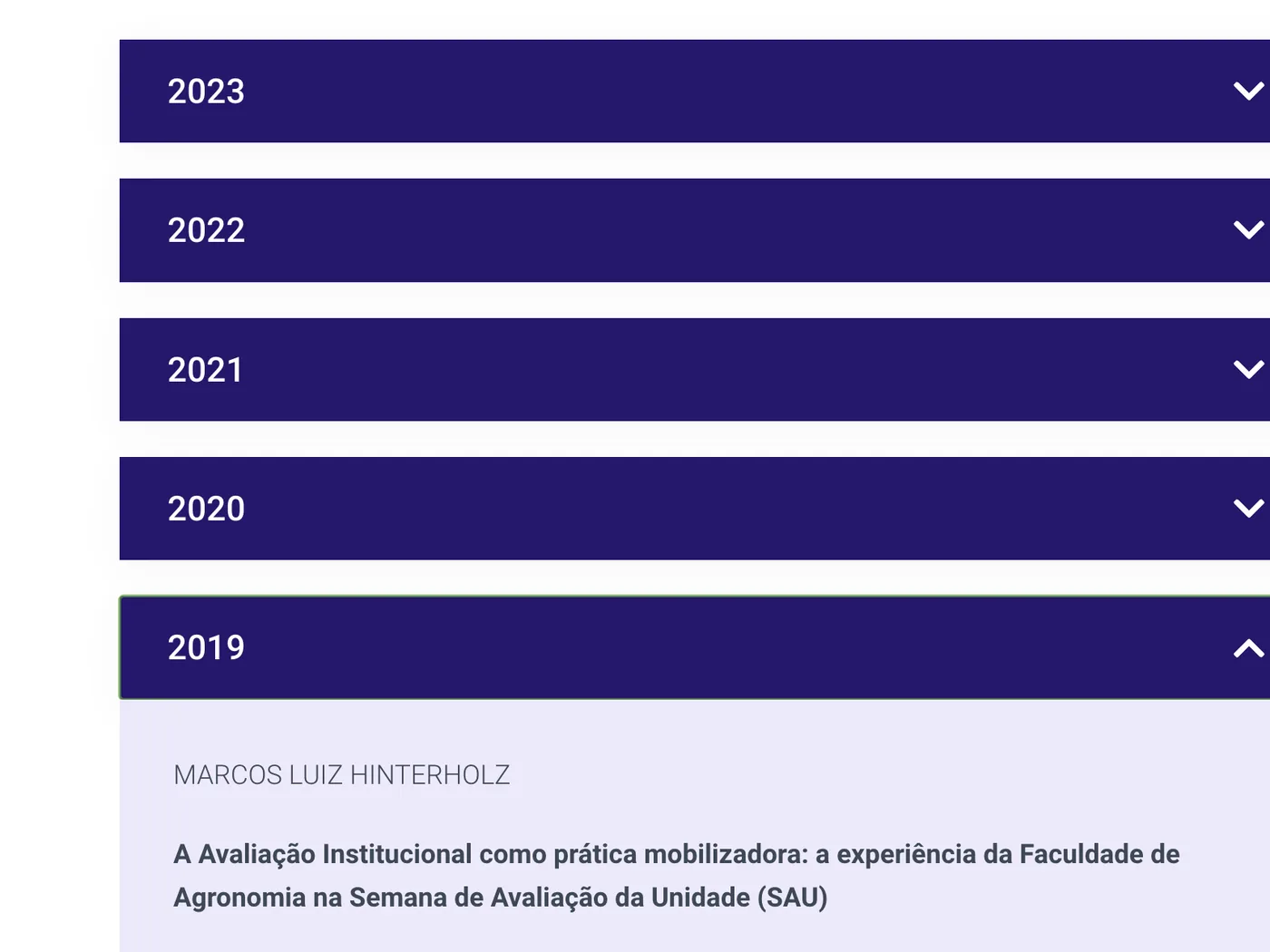
Variation 01 · Lists and documents
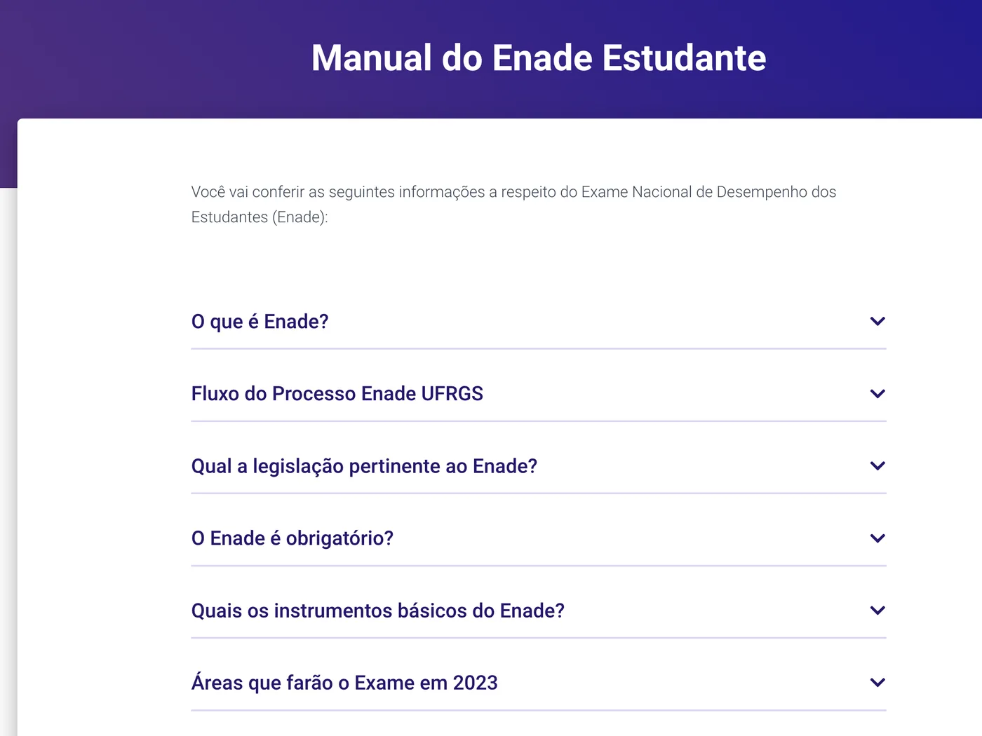
Variation 02 · Long-form content
Refinement
Refining the foundations.
Instead of a new visual language, I made the existing UFRGS identity work better on screen.
Typography
Larger, more readable sizes.
Hierarchy
Clear steps between headings, support text and body.
Spacing
Consistent gaps between content groups.
Contrast
Higher text contrast for accessibility.
Consistency
Repeatable patterns across every page.
Responsive
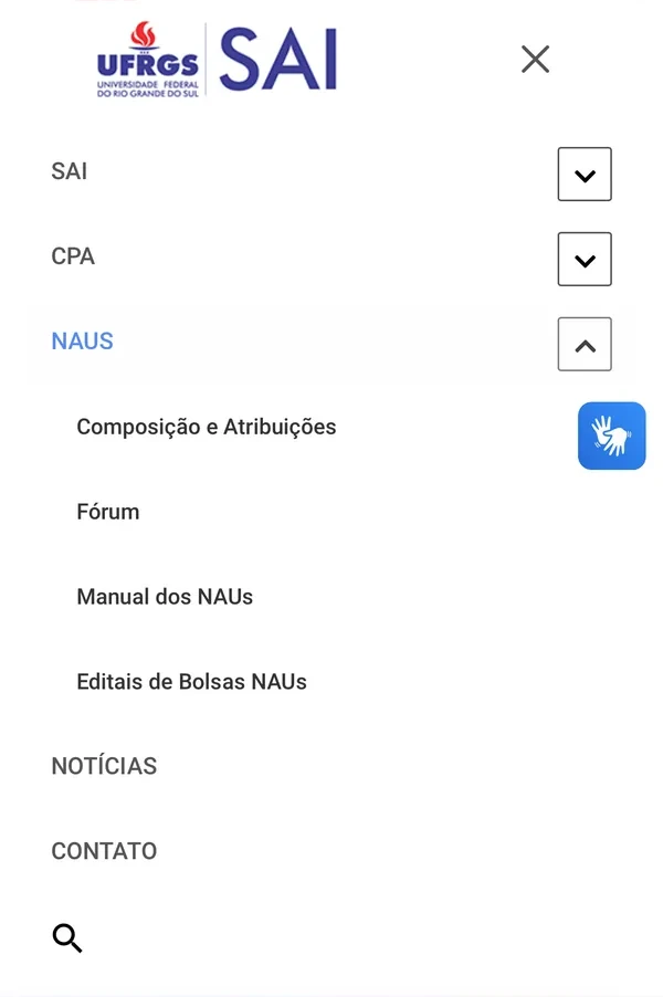
One system, three widths.
Desktop, tablet and mobile were designed together. On mobile, the menu collapses and the dropdowns keep long pages short.

Outcome
A simpler foundation.
197 → 25 published pages, with nothing lost: outdated content was archived.
Shallow, predictable navigation with room for new content.
Reusable patterns the team maintains without a designer.
Looking back: redesigning a site also means designing how it's maintained. The person adding content tomorrow matters as much as the person reading it today.